How You Should Decide Which Images to Use on Your Blog

Because visuals can make or break a blog post, it is crucial that you choose the right images for each post. The photos’ subject, colors, size, and placement can positively impact your post’s success.
Usage
The most important part of any image is logistical over visual. Only choose images that you have the rights to use. For larger blogs, it may be worthwhile to invest in a stock photo site membership, like Shutterstock or iStockPhoto. If you’d rather go with royalty-free or creative commons photos, be sure you are using the right attribution and that you can use them. For example, some creative commons photos only let you use images for non-commercial use. If you use the image for a business blog, which counts as a commercial property, so you technically can’t use non-commercial creative commons images.
In addition, it is crucial that you don’t use any images that belong to someone else, like those found on a Kickstarter store or other sites like Amazon and even Google images.
Subject
Going to ascetic properties, the subject of your photos are the most important aspect. You want your subject to be directly related to the content, without overshadowing it. For example, a post on getting out of debt shouldn’t necessarily have a photo of a bag of gold coins with a leprechauns sitting on top of it. It would be much more useful to have a graph of debt decreasing or an artful representation of a piggybank with coins going in.
Size
The size of the image needs to fit the format of the blog. For images that are on their own line and center-aligned, they can usually be bigger, like 500 to 600 pixels, depending on the blog layout. For images that run alongside content, make sure the content column isn’t too skinny, making it more difficult to read.
Colors
The colors of your image need to be visually appealing and match the emotions of your blog post. For instance, green and gold usually represent money or success, whereas red represents passion and enthusiasm. Blue is also calming, while black is usually reserved for power and mystery, according to Indiana University.
No matter what you choose for images on your blog post, attempt to visually represent what your content is trying to show. This is the best way to ensure that your blog images have an impact.
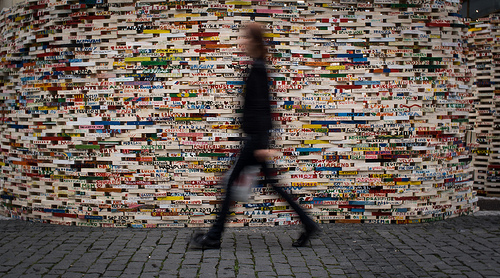
photo credit: Thomas Leuthard via photopin cc
Kelsey Jones runs her own social media and search marketing business, MoxieDot where she helps clients grow their online presence. She was voted one of the top 100 marketers of the year by Invesp in 2009 and has worked for Yelp, Run.com, and Bounty Towels. Check her out at MoxieDot and on Twitter @wonderwall7.


Thank, Kelsey, for this info on images. It’s a good reminder to go to the source of the image and make sure you have permission to use it. I think many people see all those images in google images and think they can just right click on an image and save it to their desktop or wherever and use it on their site, when in actuality, almost all of those images have some kind of usage restriction, such as paying to use them.
I believe the images you will find on the usa.gov site are free for use.
I hadn’t really thought much about the color scheme until now. I’ll keep that in mind when I’m searching for images to use. Thanks – Karleen
Good advice. I often struggle to pick good images that fit the space in the post without making the column of text next to it too narrow, which makes it hard to read.
Brilliant advice. This definitely has helped me with my own blogging techniques. I use creative commons but have a lot of difficulty looking for the right image. Have you got any suggestions?
Hmm! Great advice,i will try my best..thanks for this…
That’s great! For any website, designing plays a key role in giving the perfect presence and the images makes the most of sense of out it! Nice post Kelsey!